
Casablanca Lettering
I love lettering. Some people like to sketch animals, some like to sketch people, some prefer to sketch landscapes. I like to sketch letter forms. Predominantly mid-20th Century lettering. Sometimes these letters don’t amount to anything legible, but sometimes they do. Who knows where these ideas emerge from when you are just letting the pencil flow while the mind is in a state of flow.
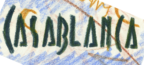
Perhaps I’ve seen too many Bogart films, but I just started sketching then name “Casablanca” in a deco san-serif style. Sometimes these random sketches stay hidden my sketchbook, never to see the light of day. But with this one I thought, “hey, that should be scanned and recreated digitally.” And so I did. Here is the evolution from random sketch to finished art.
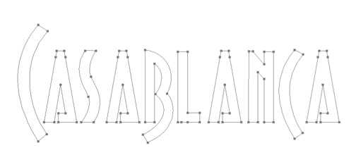
The image was scanned and opened in Adobe Illustrator. The drawing tools were used to create the paths. Thank God for the computer. I remember the day of cutting frisket film masks in preparation for the airbrush.
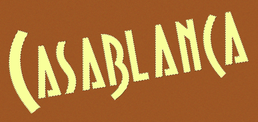
The paths are pasted into a 300 dpi Photoshop document. Layers were created for both the background and type. The type looks more dramatic at an asymmetric angle. The paths were activated as a mask and the paint bucket tool used to fill the type.
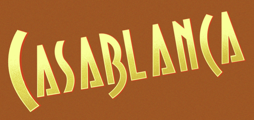
To give the letters some bulk, a red drop shadow (top) was created on a separate layer and set off from the bottom right. Also, on a separate layer above the main type, the bottom of the letters were given a few passes with the airbrush using a darker tone. The eraser tool was used to stroke the letter paths to create the lighter edge trim. Now it’s looking nicer and more sophisticated.
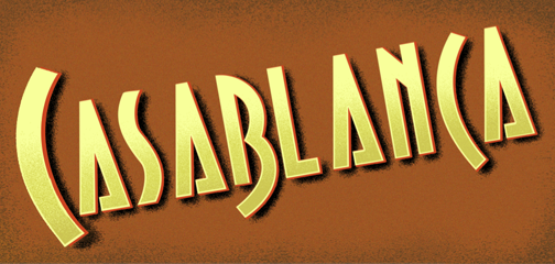
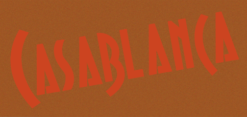
To give it even more pop, a black drop shadow was airbrushed freehand on a lower layer using the dissolve mode. Sometimes I like to step away from the safety and security or hard edged masks and go free hand. The letters are now complete.
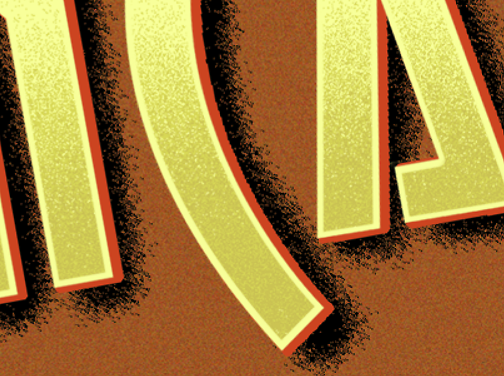
Here’s a close up shot to convey the gritty-grainy-spattery airbrush texture.
