Posts

Raise a Beer Glass

Steve Forney’s Raise a Glass Beer Poster

Raise a Glass Central Coast Brews

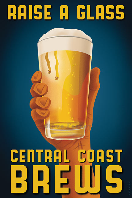
Raise a glass to the brews from California’s Central Coast.  This image was created as signed limited edition print for the Just Looking Gallery in San Luis Obispo, California.   It is available in three different sizes: 12″ x 18″ on paper, 24″ x 36″, and 40″ x 60″ both on canvas.  Click the link to contact the gallery. Read more

Naturally Elegant

Steve Forney’s Naturally Elegant White Wine Poster

A red gloved hand holds a glass of white wine from California's central Coast

Naturally Elegant is the companion piece I created to pair with Simply Sophisticated. It celebrates the magnificent white wines from California’s Central Coast. This image is of a red glove holding a glass of white wine, Read more

Simply Sophisticated Wines

Steve Forney’s Simply Sophisticated California Wines

simplySophis-blog

“Simply Sophisticated” is a new image I created for the Just Looking Gallery in San Luis Obispo, California. Everyone is familiar with the Napa Valley and their world class wines.  California’s Central Coast is an up and coming wine country with wines that rival those from Napa and Sonoma counties.  Read more

Steve Forney’s Vintage Roadside Eat Sign

forney_EAT_sign

Post World War II roadside Americana is a subject that has always caught my attention.  Having grown up in Southern California in the 1970s, these signs, many of them neon, were are fixture on the landscape.

Read more

How to Batch Resize Photographs in Photoshop

Aside from creating illustrations, I enjoy photography.  With the ease of digital photography it is easy to amass a huge number of shots during a vacation or outing. Let’s say that you have a folder of vacation photos that you’d like to send as an email attachment or that you’d like to share with others.  Using a modern digital camera, those photos will probably far too large to send as an attachment. Read more

Mission Brand Oranges Lettering

Mission Brand Oranges

Having grown up in southern California in the 60s and 70s, I can still remember the last vestiges of a once thriving citrus industry. Walking to school one could smell the oil-burning smudge pots and hear the whirling propellers that kept the precious fruit from freezing. By the 1980s most of the groves were cleared for houses and strip malls. Somewhere in my subconscious an imprint was made and years later I felt the urge to create a series of labels representing the citrus era. Here I’ll demonstrate how the lettering was created for the label “Mission Brand Oranges.”

Read more

Creating Textures in Adobe Illustrator

When making the transition from traditional to digital media, the first program I learned was Adobe Photoshop. It came the closest to replicating the gritty airbrush texture. The problem with Photoshop was the files could get huge. For example, a 16″ x 24″ image with multiple layers would be come an unwieldy monster that taxed my computer’s hard drive. Also, a Photoshop image could not be enlarged much without distorting the resolution. In contrast, Adobe Illustrator files were much smaller and retain their quality if enlarged. The problem was that earlier versions of Illustrator were great for smooth gradations, but were limited with creating texture – at least I thought so. Read more

photoshop-illustrator side by side comparison

Photoshop vs. Illustrator

Over the years Photoshop has been my tool of choice. I’m very familiar with Illustrator, but rarely used it for commissioned jobs.  In between jobs I like to play around with both programs and develop new techniques.  sometimes I’ll take an image that I admire and replicate it in either program. Poster artist Davis Lance Goines recommended doing this and remarked that the artist being copied becomes part of you.  You learn their thought process and how they must have approached a design. Read more

Casablanca Lettering

I love lettering. Some people like to sketch animals, some like to sketch people, some prefer to sketch landscapes. I like to sketch letter forms. Predominantly mid-20th Century lettering. Sometimes these letters don’t amount to anything legible, but sometimes they do. Who knows where these ideas emerge from when you are just letting the pencil flow while the mind is in a state of flow. Read more

Steve Forney’s San Francisco Golden Gate Bridge

golden gate bridge


I happy to announce the latest in my famous world landmarks series – San Francisco. This one has been planned for quite some time, but I hesitated to create it. At first it appeared that there were too many letters in “San Francisco” to fit in the space under the image. Paris, London or New York all fit with ease and are legible. San Francisco is a tight squeeze yet it does manage to work.

Steve Forney’s San Francisco is available at art.com.