Mission Brand Oranges Lettering

Mission Brand Oranges

Having grown up in southern California in the 60s and 70s, I can still remember the last vestiges of a once thriving citrus industry. Walking to school one could smell the oil-burning smudge pots and hear the whirling propellers that kept the precious fruit from freezing. By the 1980s most of the groves were cleared for houses and strip malls. Somewhere in my subconscious an imprint was made and years later I felt the urge to create a series of labels representing the citrus era. Here I’ll demonstrate how the lettering was created for the label “Mission Brand Oranges.”

Read more

Steve Forney’s Yosemite National Park Posters

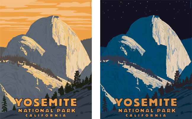
Two Yosemite posters

Yosemite National Park is one of my favorite places in this world. I’m an avid backpacker, so I’m lucky to live around 3-4 hours from the park. A recent visit inspired me to create these posters. Read more

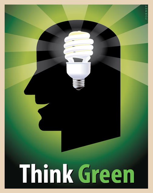
Steve Forney’s Think Green

think green

The idea for this image just came from out of nowhere.  A lightbulb went off in my head.  A compact fluorescent light bulb, to be exact.  That seemed like a clever twist to put on the visual metaphor for an idea.  I always been a fan of Jean Carlu’s posters and have studied them in detail.  Perhaps they are absorbed in my mind and now one is manifesting itself as a poster.  Think Green!  Created in Abode Illustrator.

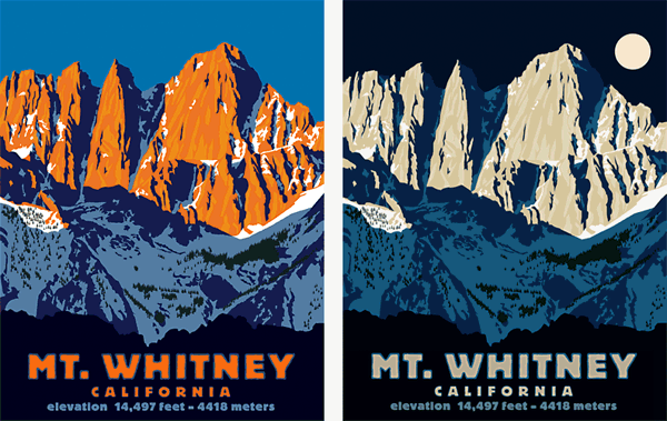
Mt. Whitney


Mt. Whitney night and day

Standing at 14,497 feet, Mt. Whitney is the highest peak in the lower 48 states. It was named after Josiah Whitney, the California State Geologist in 1864. If you’re up for a challenge then go for the 22 mile (35 km.) round-trip hike to the summit starting at Whitney Portal. It’s on my to do list.

These images are inspired by the great WPA National Parks posters of the 1930s. Both were created in Adobe Illustrator using a minimal palette of flat color, similar to the traditional silkscreen process.   At first I created the daylight version but then thought that a nighttime full moon version might work.  Speaking as one who started his illustration career using an airbrush prior to the digital revolution, it was nice to be able to clone the original work and adjust the colors instead of creating a whole new separate piece of art.

Both Mt. Whitney night and day images are available at Steve Forney’s poster store

Casablanca Lettering

I love lettering. Some people like to sketch animals, some like to sketch people, some prefer to sketch landscapes. I like to sketch letter forms. Predominantly mid-20th Century lettering. Sometimes these letters don’t amount to anything legible, but sometimes they do. Who knows where these ideas emerge from when you are just letting the pencil flow while the mind is in a state of flow. Read more

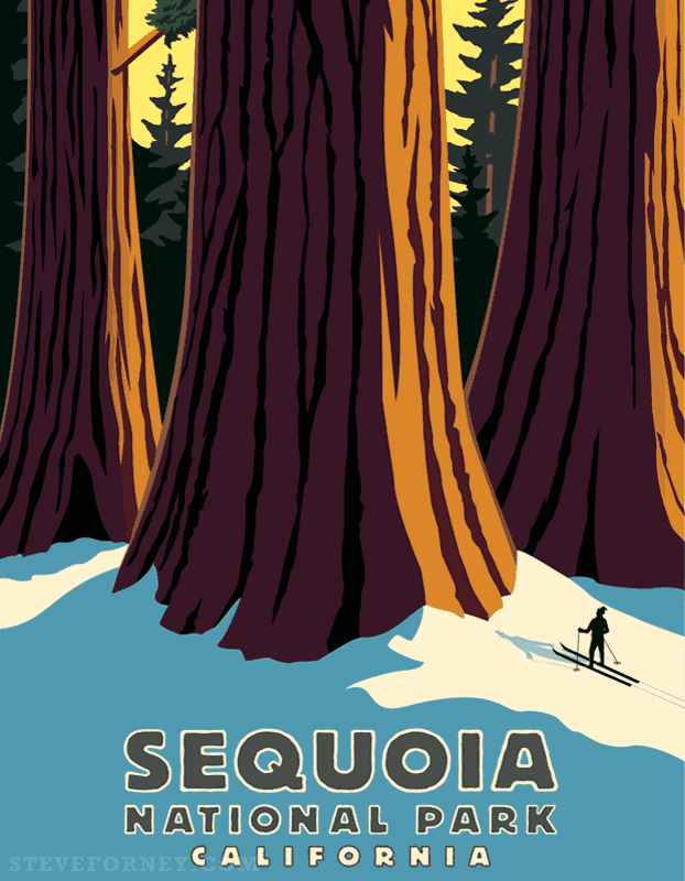
Sequoia National Park

giant sequoias


Sequoia National Park is one of my most favorite places I’ve visited.  I love to backpack and I have been thinking of a series of National Parks posters.  From Alpine peaks with clear blue lakes to flower covered meadows to giant Sequoia trees, this park will never cease to amaze the visitor.  There’s even a tree you can drive your car through.  Pretty cool!

This poster is influenced by the great WPA National Park posters.   This image was created in Adobe Illustrator and used a minimal palette of under 10 colors.  Solid shapes and blocks of color are used, similar to the silk screen process.

Steve Forney’s Sequoia National Park is available in several sizes at art.com

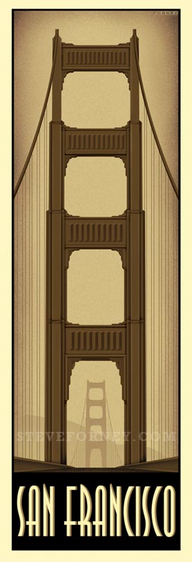
Steve Forney’s San Francisco Golden Gate Bridge

golden gate bridge


I happy to announce the latest in my famous world landmarks series – San Francisco. This one has been planned for quite some time, but I hesitated to create it. At first it appeared that there were too many letters in “San Francisco” to fit in the space under the image. Paris, London or New York all fit with ease and are legible. San Francisco is a tight squeeze yet it does manage to work.

Steve Forney’s San Francisco is available at art.com.