
Mission Brand Oranges Lettering

Having grown up in southern California in the 60s and 70s, I can still remember the last vestiges of a once thriving citrus industry. Walking to school one could smell the oil-burning smudge pots and hear the whirling propellers that kept the precious fruit from freezing. By the 1980s most of the groves were cleared for houses and strip malls. Somewhere in my subconscious an imprint was made and years later I felt the urge to create a series of labels representing the citrus era. Here I’ll demonstrate how the lettering was created for the label “Mission Brand Oranges.”
Years ago I created a few rough color sketches for a possible olive oil label with a Spanish California feel. These were done using Prismacolor pencils on tracing paper.
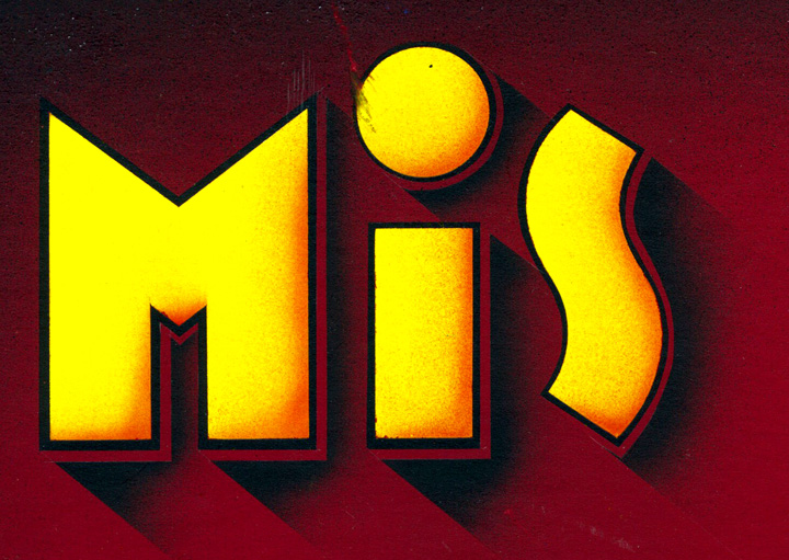
A further study is done using an airbrush, acrylic paint and frisket film on CS 10 artboard.
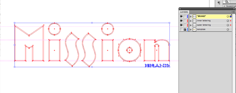
 The previous study is scanned into Adobe Photoshop. The remaining letters of the word “Mission” are created on this scan and the burgundy background is removed for clarity. Next, the scanned Photoshop image is opened in Adobe Illustrator and the paths are drawn for the yellow letters and their black trim. Building letter forms is much easier in Illustrator than in Photoshop.
 The paths are then selected, copied (Mac: Command + C) and pasted (Mac: Command + V) into the main 300 dpi CMYK Photoshop document where the final art will be created.
 Here the paths are positioned and resized in the Photoshop document.
 Now for the fun part. The paths for the yellow lettering are activated as a mask.
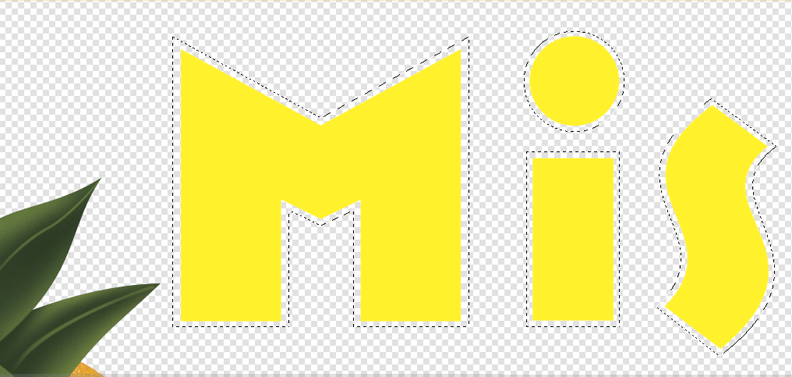 On a separate layer the paint bucket tool (key G) is used to fill in the letters.
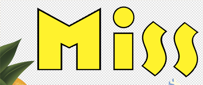 Next is the black letter trim. The outside paths are selected as a mask. A new layer is created below the yellow lettering. The blue background is temporarily turned off for clarification.
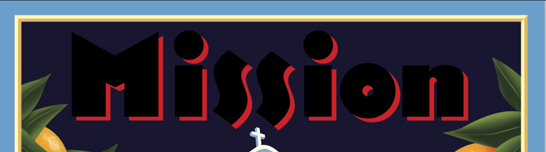 Now for the red drop shadow. The yellow letters have been temporarily turned off. The same paths used for the black trim are activated. Using the arrow keys, the mask is “walked” down to the lower right of the black letters. On a separate layer the paint bucket tool is used for a solid red fill.
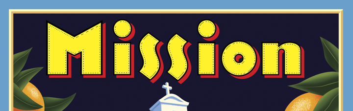
With the yellow letters turned back on, it’s time to give them some “pillowy” dimension. A new mask is created for the inside of the yellow letters. Although not demonstrated here, it was made by copying the yellow letter paths and meticulously adjusted to fit within the yellow lettering thus allowing a trim line. Small details such as this help the lettering “pop” and stand out much clearer.

It’s freehand airbrush time, digital style. After the path is activated as a mask, the brush tool is selected. It is put on dissolve mode at a low opacity, around 7%. This will give a nice gritty feel. After the dissolve mode, the brush is set back to normal but kept at a low opacity. A few passes are made to help smooth the grittiness.
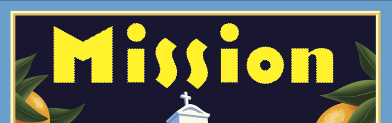
 Here’s the finished lettering.
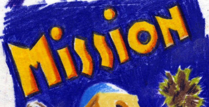
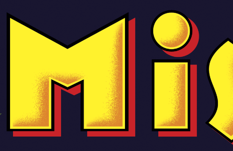 And a final close up view.
